Honza Pokorný
A personal blog
If novels were formatted like bibles
Bibles are notorious for being cluttered with all kinds of content besides the actual Word of God. Here is a list of common things:
- Chapter numbers
- Verse numbers
- Chapter headings
- Translation footnotes
- Cross-references (in the text, and in the center column)
- Chain references
- Pilcrows
The traditional setting also includes things like:
- Double column
- Verse-by-verse setting (where each verse starts on a new line)
- Words in italics
- Pronunciation marks
While these tools might be helpful for study, they certain don’t help with fluency in reading. They get in the way of your flow. As a result, you might become tired more quickly.
Instead, if bibles are to be read for extended periods of time, we should design them in such a way to support that goal. This usually means:
- Single column
- Larger font
- No references
- Paragraph format
This is what the vast majority of novels produced today looks like. Novels are works of fiction meant for enjoyment. You should be able to read them comfortably and easily.
Why shouldn’t we be free to read our bibles this way?
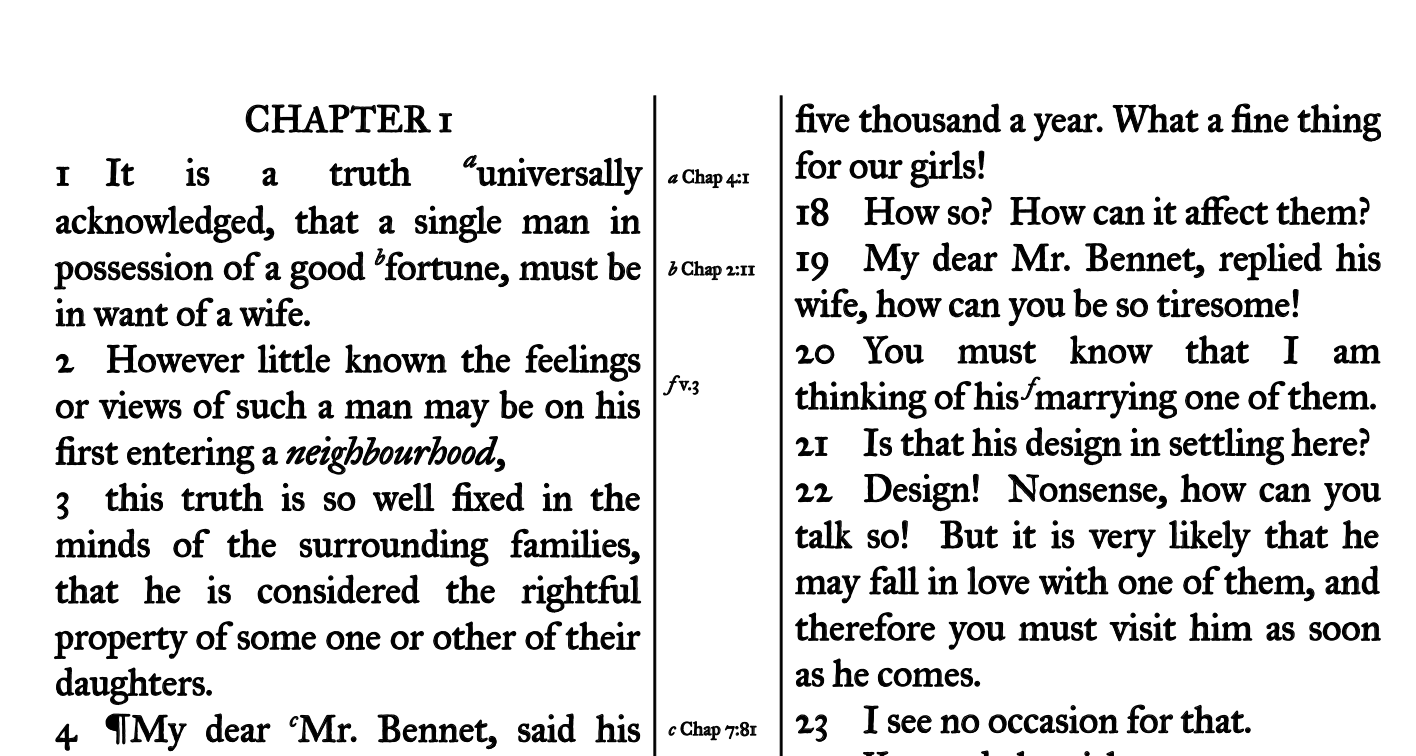
Above, you see the first few sentences of the first chapter of Jane Austen’s Pride and Prejudice. I broke it up into verses, started each verse on a new line, added some references and footnotes, and pilcrows. You will also notice the center column for references. The proportions of the page have been inspired by R.L. Allan’s Longprimer 62.
There is a PDF of the whole page for download.
This article was first published on January 25, 2019. As you can see, there are no comments. I invite you to email me with your comments, criticisms, and other suggestions. Even better, write your own article as a response. Blogging is awesome.