Honza Pokorný
A personal blog
My journey to find the best Bible

… or, ESV Pitt Minion in black goatskin review
I have been reading Mark Bertrand’s Bible Design Blog for a few years now. Through his long-form writing, I have come to appreciate beautiful typography, fine craftsmanship, single-column layouts, and attention to detail in modern Bible-making. I even helped him with a website update several years ago.
For the longest time, though, my reading was just that—reading. I couldn’t imagine spending so much money on a single Bible. I already had a few Bibles in the house, and there wasn’t any pressing need to buy another one. This spring, after saving up some money, I decided to invest in a premium Bible. I made a list of requirements, and I read and watched just about every review I could find on the world wide web. I was searching for the one Bible, the elusive unicorn of typographic design. I read articles about how that Bible doesn’t exist, and that I should just come to terms with the fact that I shall have to acquire a few different Bibles, each one for its own intended purpose.
I became addicted to the idea of single-column design. I read all about it. I could absolutely sign Mark Ward’s Bible Typography Manifesto. Two years before the search began, my wife bought me the single-volume ESV Reader’s Bible.
This Bible is relatively cheap, and gorgeous. It looks a lot more like a regular book than a dictionary or a reference book. It features a large font, single-column layout, … but its significance is in what it lacks: verse numbers, references, section headings, book introductions, etc. It’s very clean and a joy to read. I highly recommend it to anyone, and often show it off to visitors to our house. My friends are usually dismissive of the idea of a single column Bible because it doesn’t look like a real Bible. The inertia of Bible design is so tremendous that people experience a mild culture shock when looking at modern Bibles.
Unfortunately, the Reader doesn’t work as the one Bible.
From the start, I knew I didn’t want to become a Bible collector. I have no desire to own thousands of dollars worth of Bibles. I wanted to acquire a single Bible that I could use in many different scenarios. The primary motivation for this is that over time, you get to know your Bible, and you will learn where things are, and you can find them quickly. Professor Grant Horner is an advocate of this argument in his 10 chapters per day reading plan which I enjoy.
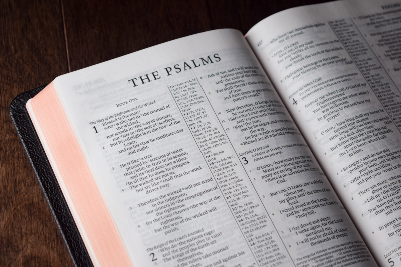
So, let’s see if we can put together a list of priorities. The Bible must work during private reading, study, public worship, family worship, and adult Bible study with others. It must be easy to read, and yet be small enough that it’s practical to carry everywhere. It must be available in the English Standard Version. It must be pleasing to the eye and to the touch. It should be rendered in single-column layout. Since I want it to be as practical as possible, it should come with verse numbers, and section headings. References are unimportant.
I was immediately captivated by Crossway’s ESV Heirloom Single Column Legacy, and Cambridge’s Clarion.
Here is the Heirloom:

(Photos via evangelicalbible.com)
Judging by the photos in Mark Bertrand’s review of the new ESV Heirloom Legacy, the Bible looks huge. This means two things for me: it features a large, readable page, and it’s likely too big to carry everywhere. This would make a great sit-at-home-and-read-for-hours Bible, but I wouldn’t drag it to church with me. Still, the page looks amazing, single column; I love the headings on the side instead of in the text. I like that it has verse numbers and no references. It makes the text look clean. This Bible will set you back 275 USD.
And here is the Clarion:
(Photos via evangelicalbible.com)
The Clarion is short and stout. I like the shape of it better than the Heirloom Legacy. Given its supple cover, it can be difficult to hold. It features references and a single-column text block. For some strange reason, the references are on the outside. This causes the text of the Bible to dip into the fold near the spine. Crossway’s Personal Reference Bible is also rendered in a single column setting but its references are in the middle. This is a much better solution in my opinion. Unfortunately, the Clarion seems to have problems with ghosting (also known as show-through), page curling, and while it’s smaller than the Heirloom, it’s still rather bulky. It’s about the same size as my ESV Reader’s Bible which definitely isn’t very portable. The Clarion costs about 255 USD.
These two Bibles are absolutely excellent, and very expensive. If I were a collector, I think both of these should be in my collection. However, that’s not why we’re here.
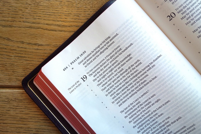
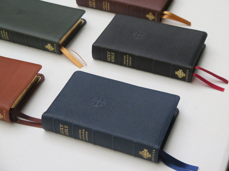
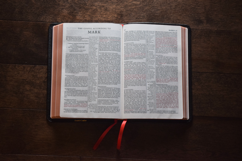
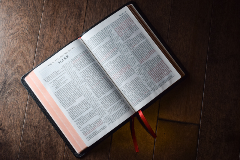
After dismissing the Heirloom and the Clarion, I was browsing publishers' websites, and came across another Bible from Cambridge: the Pitt Minion. The size of this Bible is absolutely spot on: not too big (portable), and not too small (readable), not too short and not fat. I absolutely love the black goatskin edition with the red accent of a ribbon. Only problem? It’s double column.
Initially, I dismissed it—almost immediately. Who would buy a double column Bible in 2017? But I kept thinking about the Pitt Minion, and kept coming back to it. I read all of Mark Bertrand’s reviews of it over and over. I think there are at least four articles on his website dedicated to the Pitt Minion. Mark’s argument for the Pitt Minion is that its columns are magic. There is something about the ratio between the column’s width, the font size, and the leading that makes it just work. This leads to high readability in spite of the tiny 6.75 font. Also, the size of the Bible is somewhere in between a pocket Bible and a medium sized Bible. This makes it unique in the kind of situations you’d want to use it in.
I also greatly benefited from Matthew Everhard’s videos. Matthew is a pastor who uses a Pitt Minion has his take-it-with-you-everywhere Bible, and does a video review once a year to show how the Bible is doing with daily use. I love how the leather ages, and how the board covers soften as you use it.
Once I was willing to seriously consider the double-column layout, I went back to the drawing board, as it were, and had another look at the available options. I have yet to see a Bible from R. L. Allan that I like (sorry folks). But Schuyler is a different story! Their Quentel is very intriguing, especially the Personal size version.
(Photos via evangelicalbible.com)
The only problem is the price. I live in Canada, and shipping is around 50 USD, and I’m probably going to get hit with import tax fees, etc. The Bible itself is about 175 USD. Evangelical Bible really needs to figure a better distribution model for their awesome Bibles. A lot more people would buy them if the shipping were cheaper (e.g. partner with Amazon).
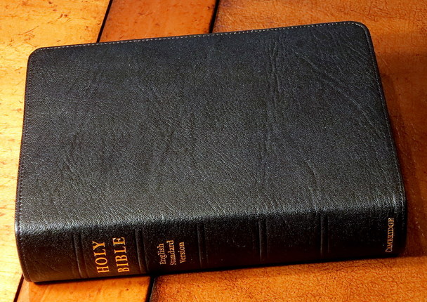
After much thought, I decided to order the Pitt Minion. Another huge reason was its price. It costs about 150 USD and I even found a great deal on Amazon, so I ended up paying about 100 USD (shipped). Compare that to the 225+ USD for the Quentel. The Pitt Minion is a steal! I opted for the black goatskin which to my eyes and heart looks the best. Just as a side note, you can get the Clarion for about that price but with a much inferior leather cover.


Just look at that delicious grain!
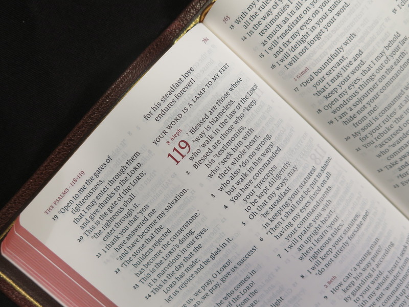
The book opens flat after a few days of handling it.
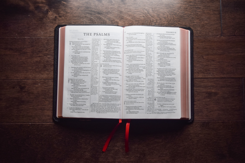
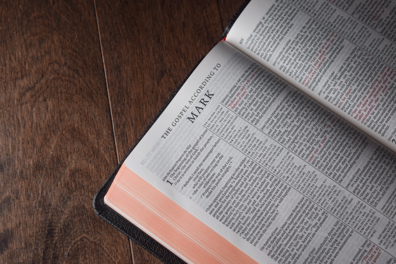
Notice the red under gold art gilding on the sides of the pages. Just gorgeous.
I love the red accent that the ribbons provide.

(Photos by me, you can use them for any purpose)
While I was waiting for it to arrive in the mail, I was rather nervous about the whole thing. But as soon as I opened the box, I was relieved and happy with the new Bible. It far exceeded by expectations. It’s even more beautiful than in the pictures.
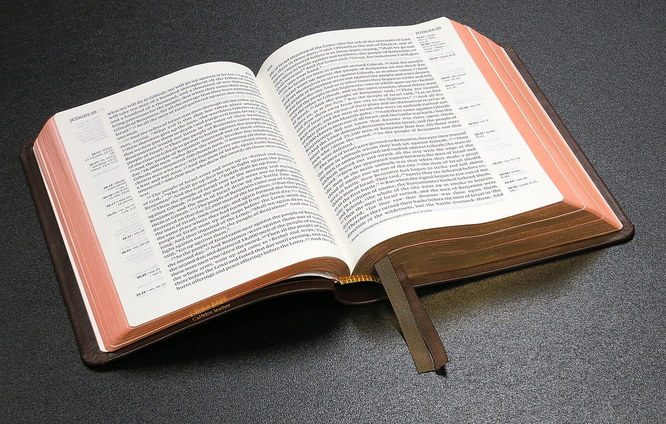
Right out of the box, the Pitt Minion doesn’t open flat. You have to handle it and read it for about a week, and then it will happily oblige. The quality of the print is exceptional. Many reviewers have said that the font is small. That might be true in the technical sense, but given the high quality of the printing, the font doesn’t feel small. Think of it like this: your normal Bible is like an old TV, it has very low resolution and unnatural colors. The Pitt Minion is your latest 4K smart TV with life-like colors. Premium Bibles stand out not just wit their binding and covers, but also with the quality of the printing. I find the font size of the Pitt Minion luxurious.
Then there is the question of the double column. I remain convinced on a theoretical level that the single column layout is superior in readability. However, it does in a sense waste space in poetry sections. This leads to more bulk in the final form factor of the Bible. In practice, I don’t feel any hindrance in reading the Pitt Minion. My eye can track the words easily, and I don’t find I lose my place often when reading for extended periods of time. Moreover, there is something to be said about the Bible looking like a Bible, and double column is certainly the more traditional look. I realize this is a pretty weak argument. With Cambridge, you are purchasing a piece of history or Bible publishing history. Cambridge University Press is the world’s oldest Bible printer and publisher. They have been in continuous operation since 1591 when they published the Geneva Bible.
Once you handle a premium Bible, you won’t settle for inferior quality. I have been reading from the Pitt Minion for several months now. I have carried it many places. I travelled to Europe with it. I certainly don’t baby this Bible. I fold back one side of the cover when reading, I roll it up when it’s closed, and I take it with me when going out. I find it delightful, and it’s truly a great all-around Bible.
This article was first published on November 2, 2017. As you can see, there are no comments. I invite you to email me with your comments, criticisms, and other suggestions. Even better, write your own article as a response. Blogging is awesome.